Live Tutorial - How to Create Templates with I Love Cards
This live tutorial shows how to use I Love Cards to create great-looking card decks using templates.
I walk through the core workflow step by step, with a concrete example: student cards built around a simple pattern; a question and a hint on the front and the answer on the back.
The focus is on templates; how they help you stay consistent, save time, and produce professional results without redesigning every card from scratch.
This is a hands-on session, recorded live, with real decisions and explanations along the way.
What You'll Learn
- How to build cards with a clear front/back pattern using templates
- How templates keep your deck structure and visual style consistent
- How to speed up production without redesigning every card
- How to make practical design decisions during real deck creation
Who This Is For
This webinar is for people who want to design educational, training, or facilitation card decks and understand how to structure them properly inside I Love Cards.
Full Video Transcript
Transcript
Introduction
In this tutorial, we're going to recreate the exact template used for these three cards. In I Love Cards, you don't need to design each card individually — you design a template, and that template is applied to all new cards.
If I click on a card to select it, then click the button to show all the content, you can see: the title of the card, detailed content with bold formatting, a card number (which I'm not using in the template), key points used on the back of the card, difficulty on the front, source on the front, and the category title displayed directly on the card. If I change the title of the category, it updates directly on the card. There's also a hint, which you can see when you rotate the card.
This is what we're going to build.
Getting Started
I've duplicated the deck — there's a button to duplicate a deck very easily — and removed the beautiful template, replacing it with a blank one.
There are multiple ways to edit a template:
- Go into your library of templates and edit from there, or
- Stay in your deck view, where you can see the name of the front and back templates. Click the template name and select Edit Deck Template.
Now we're in the template editor interface.
Part 1: Building the Front Template
Adding Fields to the Card
Usually, I start by putting all the fields into my card and then formatting them.
I already have the title of the card — I'll just make it a bit bigger. Now let's add the category title.
In Section 1, I click Add Element, choose an element from the category (not the card), and select Category Title. I drag and drop it into the section.
How Sections Work
Since it's in a section, elements stack on top of each other. If the text is smaller or bigger — say a very long title that spans two lines — it pushes the rest of the content down. This is why sections are great: they adapt to different sizes of text. Some cards might have a two-line question, others three lines — sections handle that gracefully.
Using Dynamic Primary Colors
I select the section and go to the toolbar to set a background color. You might think to just pick pink, but I don't want all my cards to have a pink background. I want dynamic color — pink for one category, orange for another, red for a third — without creating a different template each time.
You can change the primary color of each card. Instead of picking a fixed color, I use the special "primary color" swatch in the color picker. It looks like pink, but it's actually dynamic — it adapts to whatever primary color is set for each card or category.
If I save and exit, you can see: a card with orange as its primary color now shows orange. If I set it to blue, it shows blue. One template, unlimited color variations.
Adding a Second Section (The Hint Area)
The card has two areas: a colored top section and a white bottom section with the hint rotated 90°.
I add a new section, then drag and drop it to be on top. I adjust the relative sizes — the hint area should take less space than the main content area.
I can control content alignment within each section: anchored to the top, middle, bottom, or distributed to fill the full space. For the hint area, I want anchored to the middle.
In this white section, I add the Hint field from the card elements. I style it: change the color to the primary color swatch (so it matches each card's color), adjust the font to Fredoka, and set the rotation — either by dragging with Shift to snap, or by entering a precise rotation value in the bottom-right panel.
Adding the Wave Edge Effect
To make the card more visually interesting, I select a section and click the Section Edge button. I choose Wave Top and adjust the frequency and shape until it looks good.
Adding a Grid Pattern
I want a subtle grid pattern in the background. If I add it to a section, it only covers that section. Instead, I want it on the card background (behind both sections).
To do this:
- Make the top section fully transparent (remove both the color and any pattern).
- Select the card background by clicking outside the sections.
- Apply the grid pattern there: choose Grid, set it to black with low opacity for a subtle effect.
You can also try dots or other patterns — they're a great way to add character to your design.
Adding the Card Icon
Each card can have an icon (from the Lucide icon set by default). To place the icon on the template, I can't just add it to a section — it would be stuck in the section's flow.
Instead, I add it to the Overlay. Elements in the overlay are out of the normal flow — you can position them anywhere on the card.
I add the card icon, make it white, resize it, and give it:
- A background color using the primary color swatch
- Padding for breathing space
- A full corner radius to make it perfectly round
To center it precisely, I use the alignment controls (center horizontally), then fine-tune with arrow keys (Shift + arrow for larger moves).
Styling the Category Title as a Tag
I love this design pattern — category titles in small tag-like labels with all caps:
- Select the category title text
- Add a white background color
- Set the text color to primary color
- Add padding on all sides
- Add a small corner radius (not too much)
- In text settings, set Transform to All Caps
- Set to Bold
For precise font sizes, you can click the size value and type an exact number rather than using the +/- buttons.
⚠️ Note: There is no undo button in I Love Cards yet — it's on the roadmap. Be careful when deleting elements! You can find all available keyboard shortcuts in the shortcuts panel: Escape to deselect, Delete to remove, Ctrl+C/V to copy/paste, Ctrl+D to duplicate, and arrow keys to move elements.
Adding Difficulty and Source Labels
These fields need to be in fixed positions regardless of text length, so I add them to the Overlay.
I add the Difficulty Level and Source fields, then position them. The key technique here is anchor points: by default, text is anchored at the center, so longer text grows in both directions. I change the anchor to left-aligned, so the first letter always stays in the same position regardless of text length.
To align them vertically, I check their position values (e.g., both at 89% from the bottom) and match them precisely.
Adding Static Icons
For the small icons next to difficulty and source, I use free-form icon components (found at the bottom of the element list). By default they show a star icon.
To change the icon, I type the Lucide icon name directly (e.g., gauge for difficulty, book-open for source). An icon picker is coming in the next few days.
I position these icons and align them with the text fields at the same vertical position.
Part 2: Building the Back Template
Setting Up the Background and Border
I select the back template and set the background to the primary color. Then I add a card border — the border becomes visible when the section inside has a white background, creating a colored frame effect.
Creating Two Sections
The back needs two sections:
- Top section (larger) — for the icon, title, and detailed content, anchored to the top
- Bottom section (smaller) — for key points, anchored to the bottom
This means the key points always sit at the bottom, while the main content stays at the top, with flexible empty space in between that adapts to varying content lengths.
Top Section: Detail Content
I add:
- The card icon (small this time)
- The Detail Content field
For detail content, there are special typography controls because it can contain bold text, bullet points, and headings. I can configure:
- Body text font and size (I choose Nunito)
- Heading fonts (different levels can have different fonts)
- Text alignment (set to left)
I adjust the section's top padding to minimize unnecessary margin.
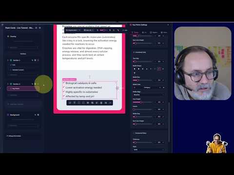
Bottom Section: Key Points
I add the Key Points custom field. For the bullet point list styling, I open the full typography settings where I can:
- Choose different bullet point styles
- Adjust bullet size
- Control the indent (where text starts relative to the bullet)
- Set bullet point vertical alignment (top, center, baseline)
- Change the font
I anchor the content to the bottom of the section and remove excess bottom padding.
Adding the "Key Points" Heading
This is static text (same on every card), so I add a free-form text element. I style it: left-aligned, bold, all caps, primary color, with the right font.
Between the heading and the bullet list, I add a Separator element — a horizontal line designed exactly for this purpose. I adjust its margins (no top margin, small bottom margin) and set its color to the primary color.
Printing Your Cards
To print and test:
- Go to Share → Download → Print
- Choose your card size (e.g., Poker size for testing — you can easily switch to Jumbo or other sizes later)
- Set paper size (A4 for European users gives 9 cards per page)
- Enable cutting guides with crop marks
- Export to PDF
- Print on your home printer, cut along the crop marks, and test with real participants!
How Card Sizes Work
Unlike other design software where you must define the size upfront, I Love Cards handles size changes gracefully:
- If you keep the same portrait orientation and similar aspect ratio, your template adapts automatically
- Switching between similar sizes (e.g., Micro to Euro) works well
- Square decks work fine too
- Extreme ratio changes (like switching to Domino) may need minor adjustments
- Any adjustments only need to be made to the template — not to individual cards
Q&A
Can I use custom icons or images?
Yes. Go to Free Form → Images and upload any custom SVG or PNG. You can also upload photos — either in the template (same photo on all cards) or as a card illustration field (different photo per card). You can even add multiple image fields: one for the front, one for the back.
Can I upload existing card designs?
You could upload full card images, but you'd lose all the benefits of I Love Cards: dynamic colors, easy editing, adding new cards, and upcoming features like multilingual support. It's better to recreate your cards in the system. Most training and facilitator card decks (around 95%) can be perfectly replicated. If you encounter something that's not yet possible, reach out and we can discuss adding new features.
What languages are supported?
You can write your cards in any language. The interface is in English, but card content can be in French, or any other language. Currently, you can have one language per deck. Coming soon: AI-powered translation to create multiple language versions of your deck (this will be a premium feature).
How does the pricing work for groups?
Each person needs their own license. The current launch price is €149 for a lifetime membership — one license per person.
Can I import content from a spreadsheet?
Yes! You have several options:
- Create cards one by one (there's a table view for quick editing with keyboard navigation)
- Import from a spreadsheet: copy your data from Google Sheets, paste it into I Love Cards, and the AI analyzes your columns — mapping them to standard fields (title, description, card number) and creating custom fields as needed. Hundreds of cards can be imported in just three clicks.
What AI is used?
Currently GPT-4 Mini (fast and low-cost). AI usage is currently free but will move to a token-based system (e.g., €10 token packs) to provide access to more powerful AI models. Text generation costs are minimal; image generation is more expensive (about $10 for 50 AI images).
Should I set the card size at the start?
You can decide later. I Love Cards is designed to handle size changes well, especially if you keep a similar aspect ratio. But if you can, it's better to decide early to avoid any minor adjustments later. Any changes you do need to make only affect the template, not individual cards.
Keyboard Shortcuts Reference
| Shortcut | Action |
|---|---|
| Escape | Deselect element |
| Delete | Delete element |
| Ctrl+C / Ctrl+V | Copy / Paste |
| Ctrl+D | Duplicate |
| Arrow keys | Move element (fine) |
| Shift + Arrow keys | Move element (large) |
| Guide snapping | Automatic |
| Rotation snapping | Automatic |
Tutorial by Alex, founder of I Love Cards.