Create a Color Palette
What a Color Palette Is
A palette defines the colors associated with color tokens (like Brand color 1 or Category color 3).
If you change brand color 1 in the palette from red to blue, all cards using brand color 1 will now be blue.
A palette has four types of tokens:
- 3 Brand colors - Identity and branding
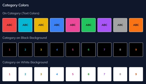
- 9 Category colors - Card differentiation
- 10 Neutral colors - Structure (text, backgrounds, borders)
- Contrast variants - Readable versions for light/dark backgrounds
Each deck can only have one palette. All cards in that deck use it.
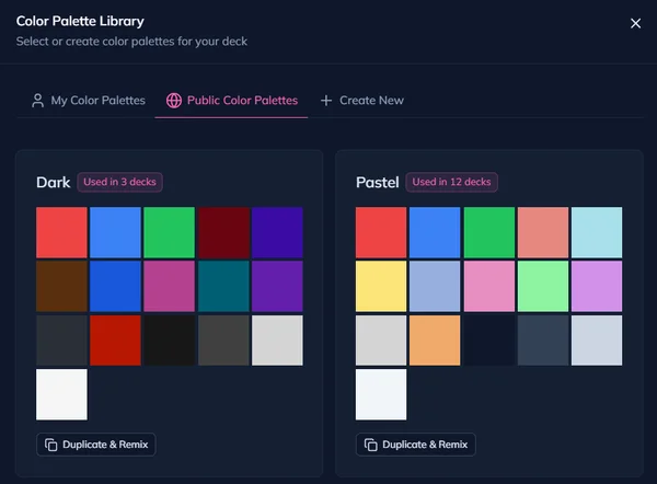
Open the Palette Library
The palette library is a collection of palettes that you can use in your decks. You can also create your own palettes.
To open:
- Open your deck in the deck builder
- Click Edit colors in the deck toolbar
- A drawer opens with palette options
You can:
- Duplicate & Remix a public palette - Got to the "Public Color Palettes" tab and select one to start from a community palette
- Reuse one of your existing palettes - Got to the "My Color Palettes" tab and select one of your own palettes
- Create New - Click on that button to create a new palette from scratch
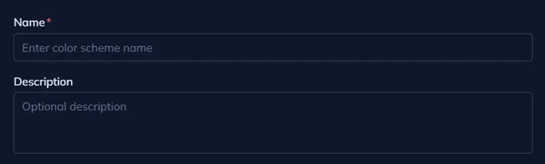
Name Your Palette
Give it a name and an optional description.
Define Brand Colors
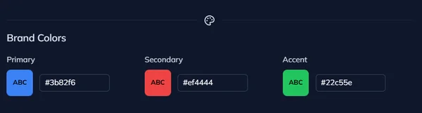
Brand colors express your deck's identity - organization, methodology, or visual style.
Define Category Colors
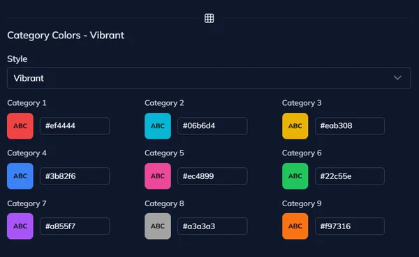
Category colors create visual distinction between card types.
Predefined styles:
- Vibrant (default palette) - Bold, saturated
- Pastel - Soft, muted variation of default palette
- Dark - Dark variation of default palette
Pick a style, then customize individual colors if needed.
Define Neutral Colors
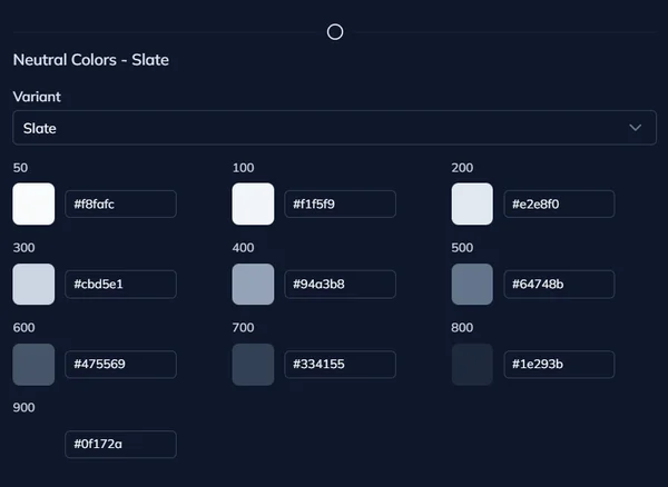
Neutrals are grays and subtle tones for structure without meaning.
You also can pick from some predefined neutral palettes like Slate, Gray, Zinc, Neutral, or Stone.
Contrast Variants
Auto-generated readable versions of brand and category colors.
For each color:
- On light - Darker variant for light backgrounds
- On dark - Lighter variant for dark backgrounds
For example, if you have a yellow brand color that you want to use for some text on a white background, you can use the darker variant for a much better contrast.
Color Concepts in I Love Cards
How I Love Cards implements color through roles, palettes, and inheritance - creating a flexible system that separates design intent from specific color values.
Assign Colors in a Template
Apply color roles to text, backgrounds, and borders in the template designer. Use color references to create reusable, adaptive templates.