The Silent Language of Card Deck Colors
Picture this: a workshop facilitator spreads fifty cards across a conference table. Participants lean in, hands hovering over the scattered deck. Without reading a single word, they already know which cards are questions, which are activities, and which are reflection prompts.
In card decks, color is never just decoration; it’s information architecture.
The Two Jobs Color Does in Card Decks
Every successful card deck uses color to solve two fundamental challenges.
1. Creating Identity
Some colors establish who this deck is. They create instant recognition, convey emotional tone, and support visual consistency.
Think of decks that are recognizable from across a room. A limited, consistent palette acts like a signature. Even before reading the content, you know which deck you’re holding.
These identity colors usually stay stable across the entire deck. They’re not there to help you sort cards; they’re there to anchor the experience.
2. Enabling Navigation
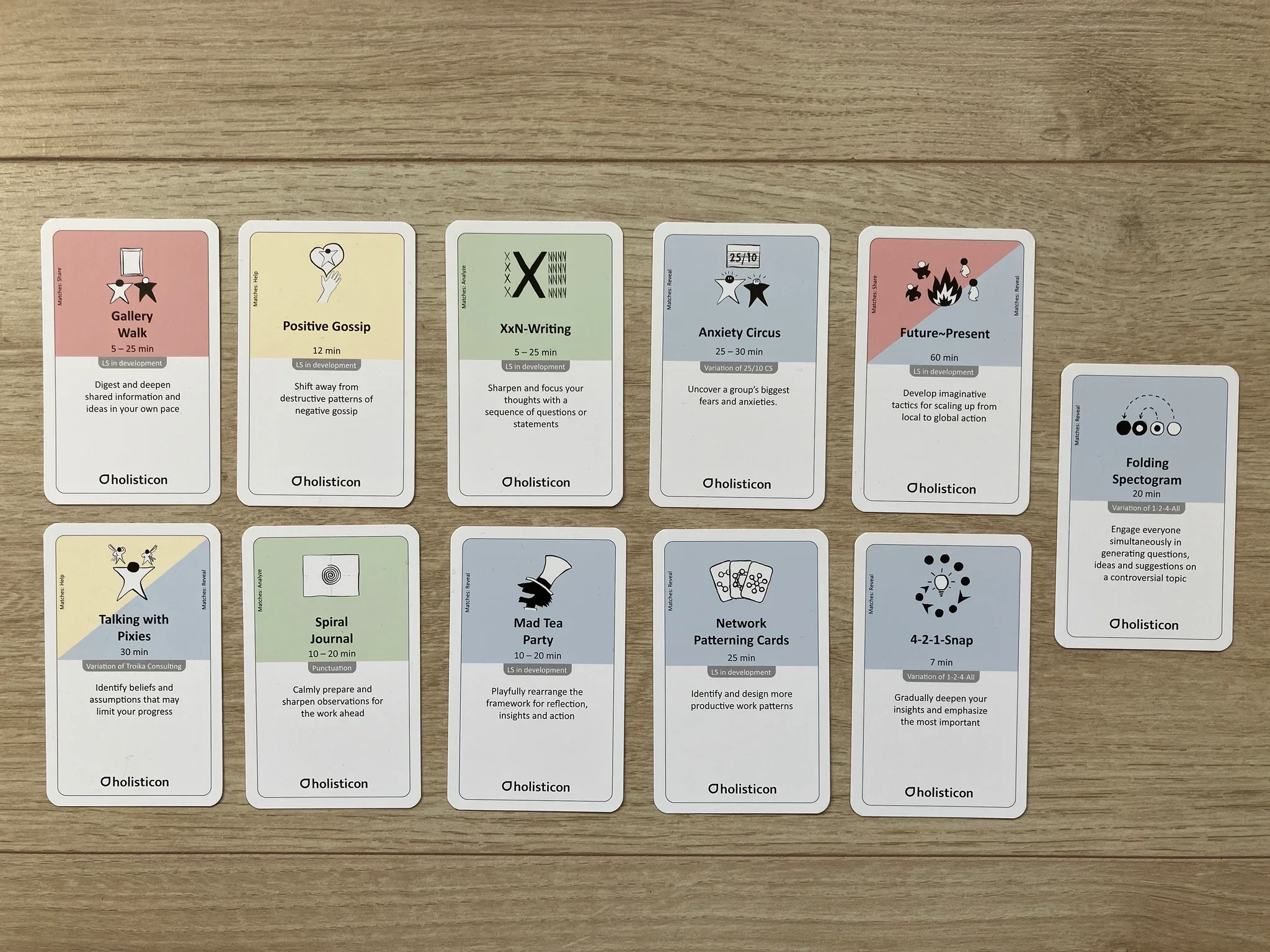
Other colors help users find and organize cards. They create visual categories, enable fast sorting, and make large decks usable.
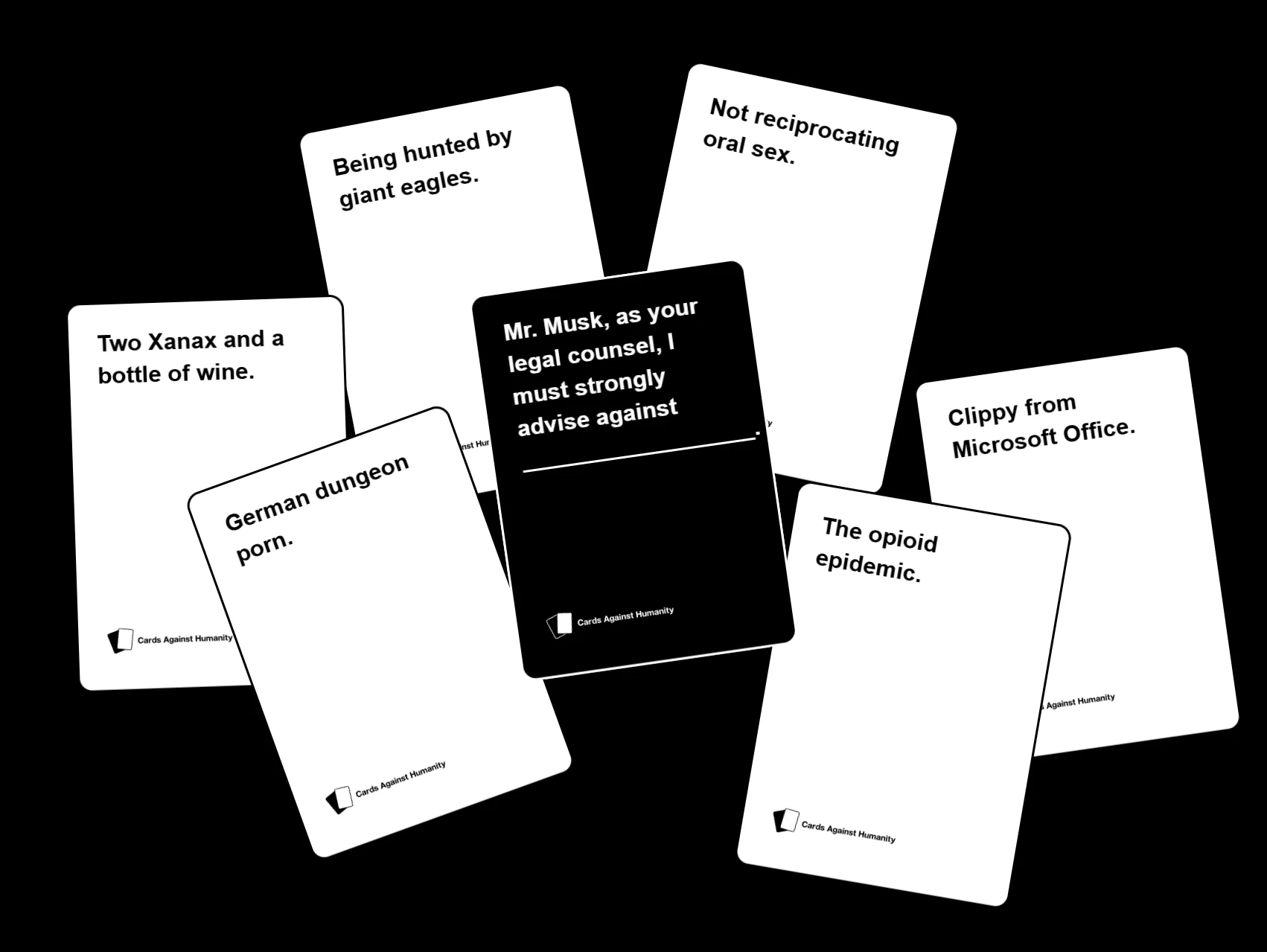
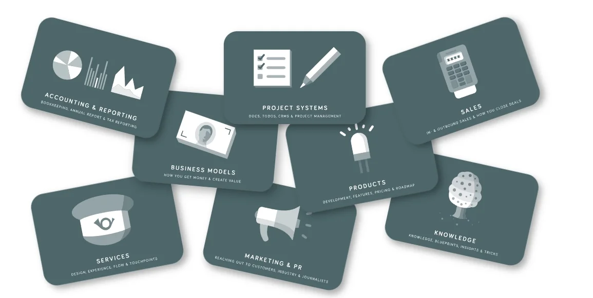
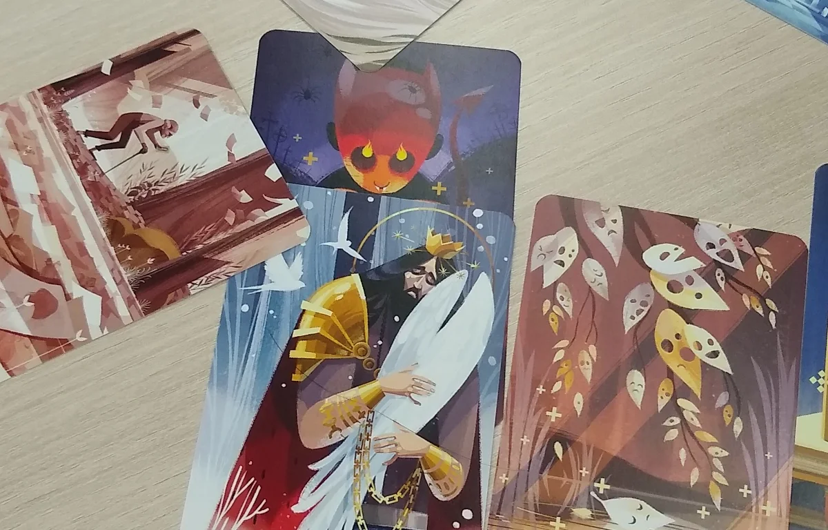
When Cards Against Humanity shows you black cards for questions and white cards for answers, that’s navigation. When tarot decks use color to distinguish suits; cups (blue or water), wands (red or fire), swords (yellow or air), pentacles (green or earth); that’s navigation. The color tells you what type of card you’re holding before you read it.
The most effective decks balance both roles; strong identity colors paired with clear navigation colors.
What Great Decks Do With Color
Let’s look at how real decks solve the color puzzle.

The Psychology Behind the Swatches
Color isn’t neutral. It carries meaning, triggers emotion, and behaves differently across cultures.
Cultural Context Matters
Red signals danger in many Western cultures but prosperity in Chinese culture. Blue feels trustworthy in corporate settings but cold in others. If your deck is used internationally, test color associations with your actual audience, not just your assumptions.
Accessibility Is Non-Negotiable
About 8% of men and 0.5% of women have some form of color vision deficiency. If your navigation relies entirely on distinguishing red from green, you’re excluding millions of people.
Effective approaches include:
- Combining color with icons, patterns, or labels
- Ensuring strong contrast between categories
- Testing with color-blindness simulators
- Using borders or texture as secondary cues
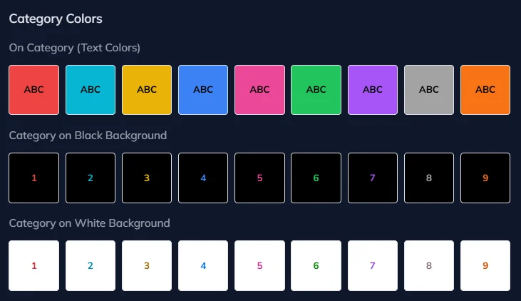
I Love Cards includes automatic contrast features that switch text between black and white based on background color, ensuring readability across palettes without manual tuning.
Cognitive Load Is Real
People can reliably distinguish about five to seven colors in fast decision-making contexts. Beyond that, categories start to blur together. A deck with twelve categories and twelve colors may look clever, but it will feel exhausting to use.
Designing color sets that are truly distinct is harder than it looks. That’s why I Love Cards includes three pre-built palettes of nine colors, each optimized to be as different as possible.
Here’s the Vibrant Color Palette as an example:
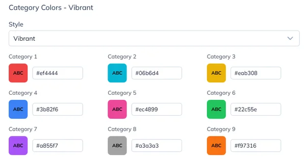
Getting nine colors that stay distinguishable on a cluttered table, under mixed lighting, and for different types of color vision is already difficult. Adding a tenth that’s clearly different from all the others? Nearly impossible. Contact me if you crack it 🤣
Start in Grayscale
Here’s a counterintuitive tip: design your first prototype without color at all. Use only black, white, and gray.
You can still preview the grayscale prototype deck here: Open the prototype deck.
Color is seductive. It’s easy to fall in love with a nice palette before solving the harder problems. Is the hierarchy clear? Is the typography readable? Does the layout still work when cards are spread across a table?
A grayscale prototype forces you to get the fundamentals right. If the deck works in black and white, it will work even better with color. If it needs color to make sense, that’s usually a sign the structure isn’t doing its job yet.
In I Love Cards, you can approach this in two ways. Build a template using only gray tones, or build one with dynamic primary colors and set the deck’s default color to gray. Everything stays neutral until you’re ready. When you assign colors to categories, the whole deck comes alive instantly, without touching the template.
Common Pitfalls to Avoid
Too Many Colors
If participants need a legend to remember what each color means, you’re using too many.
Too Similar
Light blue, medium blue, and teal may look different on your screen. On a messy table under fluorescent lights, they collapse into the same color.
Color-Only Coding
If color is your only navigation system, accessibility suffers. Always add redundant cues like icons or labels.
Ignoring Print Reality
Screen colors rarely match printed cardstock. Always test physical samples before committing to a full print run.
Skipping Iteration
Your first palette won’t be perfect. Prototype, test, and retest with real users in real conditions. I Love Cards makes this easy. Change a palette once and see your entire deck update instantly, print at home, and iterate fast before going to production.
Want to design great-looking cards even if you have no design skills?
Join me for a free live tutorial: Design Great-Looking Cards in No Time
I'll show you how to create beautiful cards in minutes using smart templates in I Love Cards. This is hands-on—I'll build a template from scratch and apply it to multiple cards so you see the results immediately.
No design experience needed.
Why Cards Are Such a Great Tool for Trainers and Workshop Facilitators
Slides put everyone to sleep. Sticky might be too creative for some people. Cards hit the sweet spot between structure and flexibility, making abstract concepts tangible and keeping participants engaged.
Prototype Fast; Learn Faster
How I prototyped and tested a new card deck in almost no time, and why short feedback loops completely changed how the deck evolved.